- → Anonymous
- → Responsive Bootstrap Navbar with Mobile ...
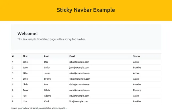
Responsive Bootstrap Navbar with Mobile Toggle and Remix Icons
This responsive Bootstrap 5 navbar features a clean and modern design, enhanced with Remix Icons for login and cart functionality. It includes a desktop navigation layout with a logo, links, search bar, and action buttons, while the mobile version adapts seamlessly with a toggle menu. Ideal for e-commerce or multipage websites seeking a sleek and user-friendly header layout.
This bootstrap css example is contributed by Anonymous, on 25-May-2025. Component is made with bootstrap css v.5.3. It is responsive.

Author Anonymous
More Examples
-
 page title section
do not copy
3 weeks ago31v.4.6 -
e mask 3
portfolio
3 weeks ago60v.4.6 -
navber
tui abre o chor tui copy korte acshsos
3 weeks ago79v.4.6 -
 1 year ago3.3kv.5.3
 -
Fitar's navbar
do not copy
3 weeks ago58v.4.6 -
 Responsive Bootstrap Navbar with Mobile Toggle and Remix Icons
This responsive Bootstrap 5 navbar features a clean and modern design, enhanced with Remix Icons for login and cart functionality. It includes a desktop navigation layout with a logo, links, search bar, and action buttons, while the mobile version adapts seamlessly with a toggle menu. Ideal for e-commerce or multipage websites seeking a sleek and user-friendly header layout.
1 year ago3.5kv.5.3 -
Elon Musk
nav and footer
3 weeks ago105v.4.6 -
 10 months ago2.7kv.5.3
 -
 10 months ago4.2kv.5.3
 -
3 weeks ago67v.4.6
-
3 weeks ago53v.4.6
-
cllient review
do not copy
3 weeks ago42v.4.6


Didn't find component you were looking for?
Search from 300+ componenent

