- → Tane Mahuta
- → About Our Company
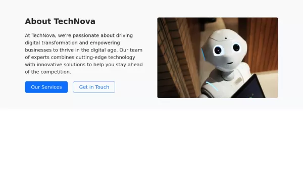
About Our Company
Display your company data
This bootstrap css example is contributed by Tane Mahuta, on 17-Jul-2024. Component is made with bootstrap css v.5.3. It is responsive. similar terms for this example is about me

Author Tane Mahuta
More Examples
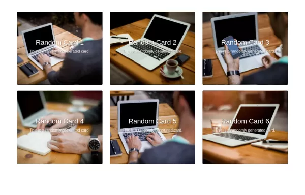
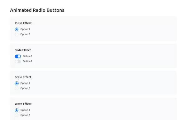
-
 1 year ago2.7kv.5.3
 -
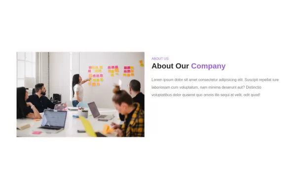 About us section
about us section with image
2 years ago2.3kv.4.6 -
 2 years ago2.2kv.4.6
 -
 2 years ago1.3kv.4.6
 -
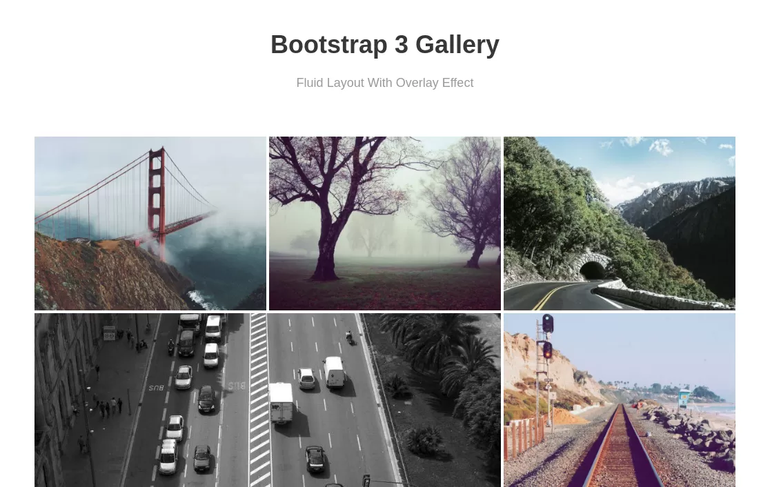
 2 years ago3.8kv.4.6
 -
 Bootstrap tabs
tab navigation
1 year ago2.3kv.5.3 -
 1 year ago5.5kv.5.3
 -
2 years ago4kv.5.3
-
 Bootstrap Login Modal
Elegant Login Form
1 year ago5.1kv.5.3 -
 2 years ago6.1kv.3.4
 -
 1 year ago2.7kv.5.3
 -
 1 year ago1.6kv.5.3


Didn't find component you were looking for?
Search from 300+ componenent

