- → Anonymous
- → Coming Soon Landing Page
Coming Soon Landing Page
This bootstrap css example is contributed by Anonymous, on 01-Oct-2024. Component is made with bootstrap css v.5.3. It is responsive. similar terms for this example are upcoming, Pre-launch page, Teaser page, Under construction page, Placeholder page, Sneak peek page,Launch page

Author Anonymous
More Examples
-
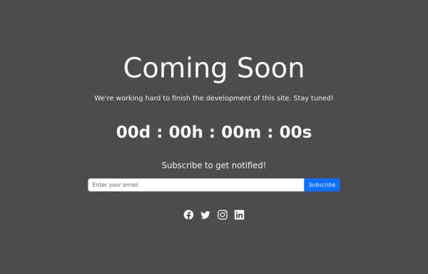 Coming Soon Page
Coming Soon Landing page
1 year ago1.7kv.5.3 -
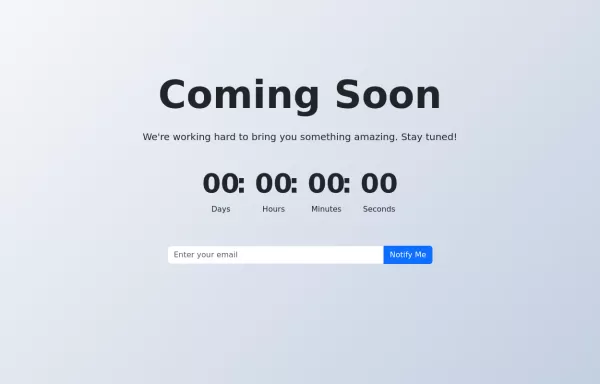 Coming Soon Page
Coming Soon landing page example made with Bootstrap 5
1 year ago1.5kv.5.3 -
 1 year ago952v.5.3
 -
 Form Wave
Form Wave
1 year ago1.7kv.4.6 -
 Modern Dashboard Analytics Card
A sleek, modern dashboard component featuring animated metric cards with progress indicators and trend badges. Perfect for displaying key business metrics like revenue, users, and orders with visual progress tracking.
1 year ago5.5kv.5.3 -
 1 year ago1.6kv.5.3
 -
 3 weeks ago69v.4.6
 -
 Navbar
a responsive navbar with search
2 years ago9.8kv.5.3 -
 10 months ago2.7kv.5.3
 -
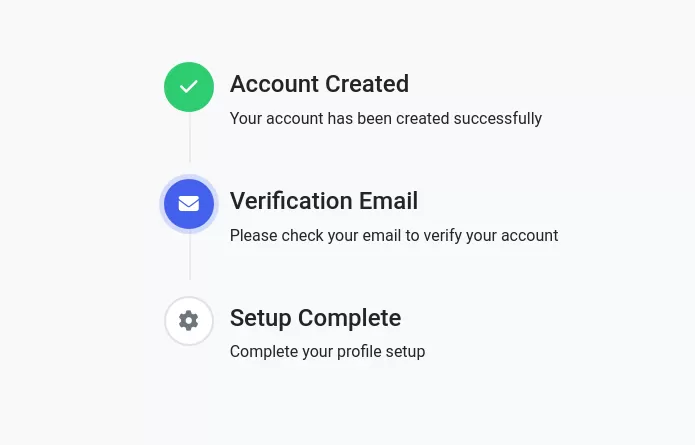 Vertical Stepper (Interactive)
Stepper component with Navigation buttons
1 year ago8.4kv.5.3 -
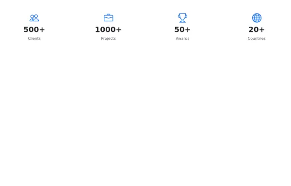 Simple stats section
Minimalist stats example made with bootstrap 5
1 year ago1.6kv.5.3 -
page Title
goribera toder jonno kosto kore bana lam nsda exam er jonno
1 month ago92v.5.3


Didn't find component you were looking for?
Search from 300+ componenent

