- → Asmath
- → Boostrap Buttons
Boostrap Buttons
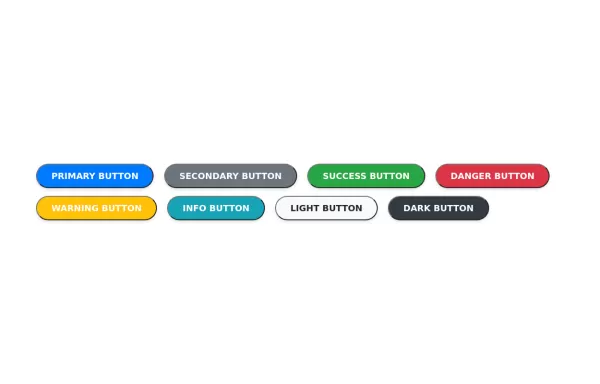
Basic Buttons - Standard button styles with different color variations
Outline Buttons - Ghost buttons with colored borders that fill on hover
Button Sizes - Three different size variations for different contexts
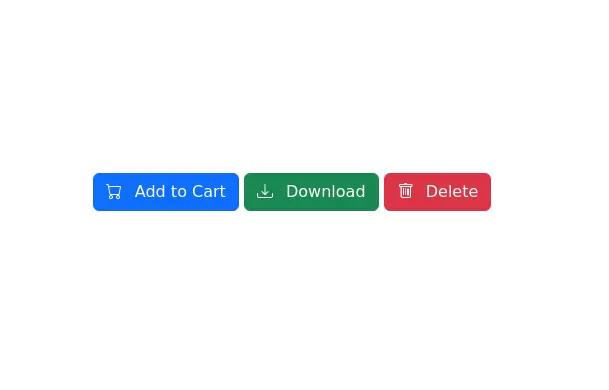
Icon Buttons - Buttons with Bootstrap Icons integration
Block Buttons - Full-width buttons using Bootstrap's grid system
Button Groups - Grouped buttons for related actions
Loading Buttons - Interactive buttons with loading spinners
This bootstrap css example is contributed by Asmath, on 26-Dec-2024. Component is made with bootstrap css v.5.3. It is responsive.

Author Asmath
More Examples
-
 7 months ago491v.4.6
 -
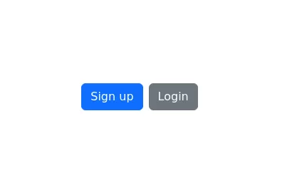 Button pair
sign up and login buttons
1 year ago1.7kv.5.3 -
3 weeks ago228v.4.6
-
1 week ago55v.5.3
-
 2 years ago7.7kv.4.6
 -
 1 year ago2.7kv.5.3
 -
 Sound Board
Sound Board
1 year ago1.8kv.4.6 -
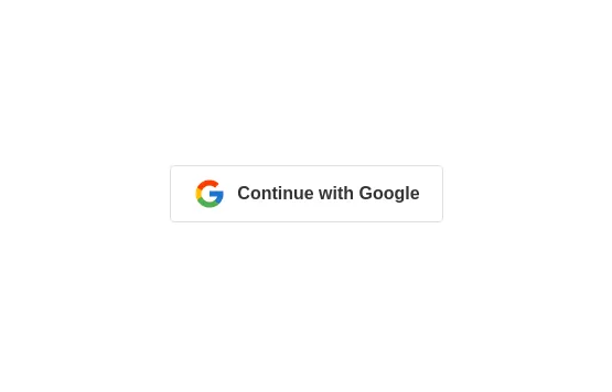
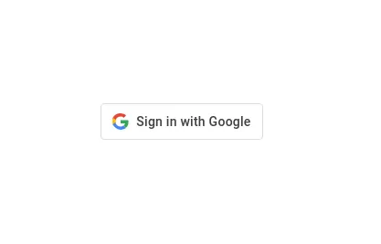
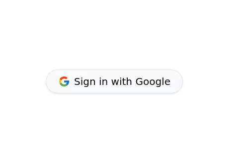 Login with google button bootstrap
Sign in with the Google button
1 year ago5.8kv.5.3 -
1 year ago3.1kv.5.3
-
 Hidden Search Widget
Hidden Search Widget
1 year ago1.7kv.4.6 -
 2 years ago7kv.5.3
 -
 2 years ago2.7kv.5.3


Didn't find component you were looking for?
Search from 300+ componenent

