- → Ankit khedkar
- → Accordion example with Bootstrap 5.3
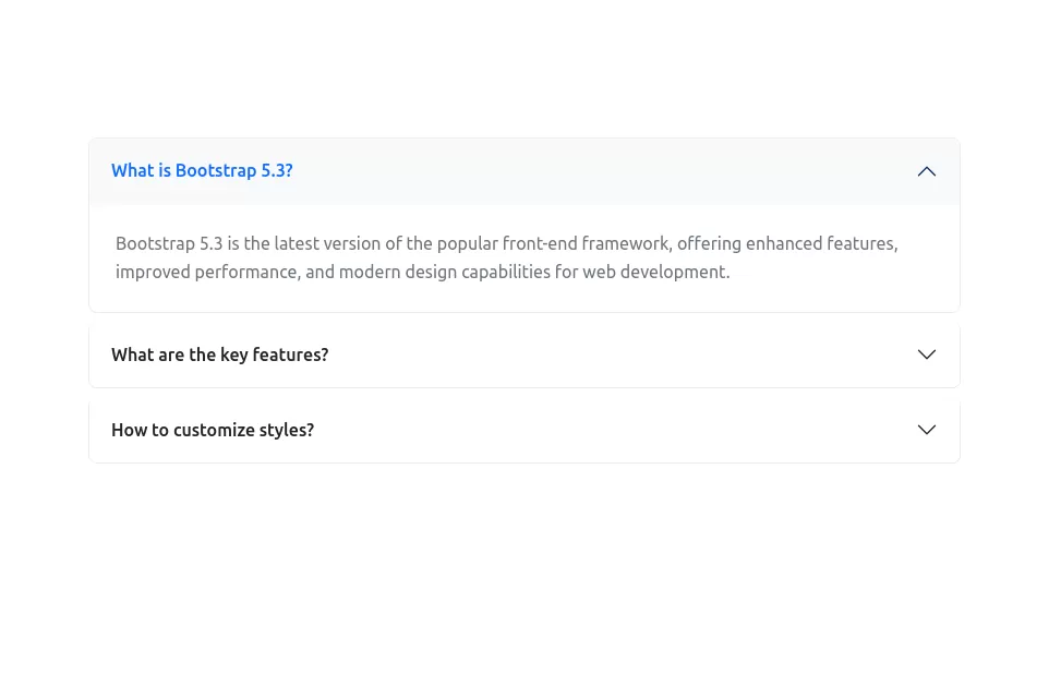
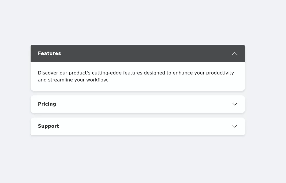
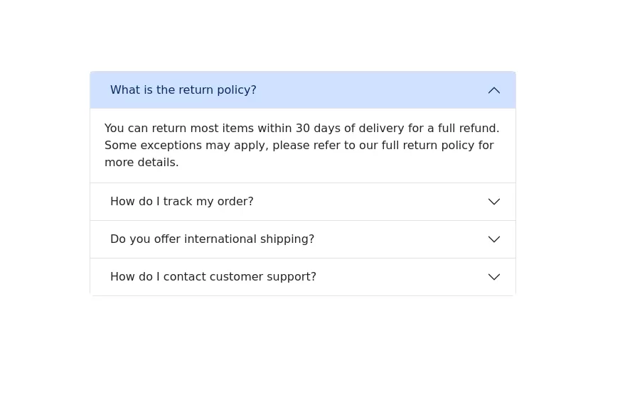
Accordion example with Bootstrap 5.3
This bootstrap css example is contributed by Ankit khedkar, on 24-Jul-2024. Component is made with bootstrap css v.5.3. It is responsive. similar terms for this example is collapsible
Author Ankit khedkar
More Examples
-
Bootstrap 5.3 Accordion
Modern Bootstrap 5.3 Accordion
1 year ago3.3kv.5.3 -
1 year ago4.4kv.5.3
-
Accordion example with Bootstrap 5.3
accordion with animation
1 year ago3kv.5.3 -
Accordion FAQ section
Minimal and with beautiful animation
1 year ago9.2kv.5.3 -
Accordion example with Bootstrap 5.3
accordion with animation
1 year ago9.2kv.5.3 -
FAQ accordion
The accordion component is a vertically stacked set of items
1 year ago5.3kv.5.3 -
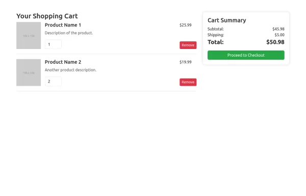
Bootstrap 5 shopping cart design
clean and beautiful shopping cart component
1 year ago4.2kv.5.3 -
Responsive Bootstrap Navbar with Mobile Toggle and Remix Icons
This responsive Bootstrap 5 navbar features a clean and modern design, enhanced with Remix Icons for login and cart functionality. It includes a desktop navigation layout with a logo, links, search bar, and action buttons, while the mobile version adapts seamlessly with a toggle menu. Ideal for e-commerce or multipage websites seeking a sleek and user-friendly header layout.
9 months ago3kv.5.3 -
9 months ago839v.5.3
-
1 year ago2.5kv.5.3
-
7 months ago1.9kv.5.3
-
Bootstrap user profile
User profile card made with bootstrap
1 year ago7.3kv.5.3
Didn't find component you were looking for?
Search from 300+ componenent
