- → Juan Martinez
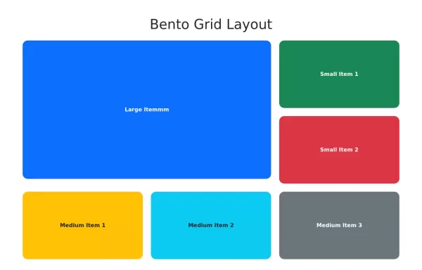
- → Bento Grid Layout with Images
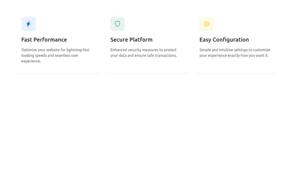
Bento Grid Layout with Images
This bootstrap css example is contributed by Juan Martinez, on 15-Jul-2024. Component is made with bootstrap css v.5.3. It is responsive.

Author Juan Martinez
More Examples
-
 1 year ago7kv.5.3
 -
 Responsive Card Grid
A responsive grid of cards with hover effects
2 years ago7kv.5.3 -
 4 Column
Bootstrap 5 Grid System
1 month ago100v.4.6 -
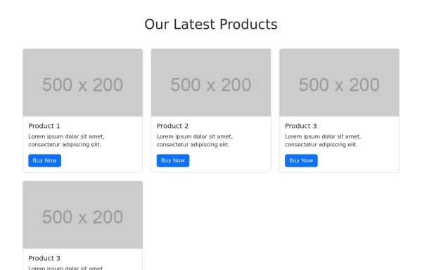
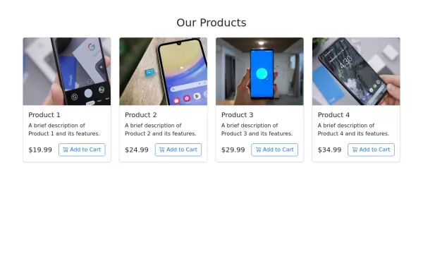
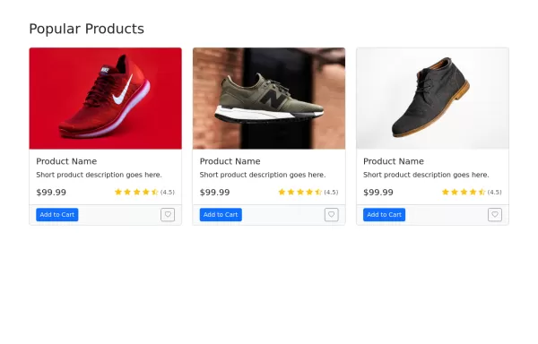 Products Grid
E-commerce product grid
1 year ago5.8kv.5.3 -
 2 years ago6.4kv.3.4
 -
 1 year ago1.8kv.5.3
 -
 1 year ago3.9kv.5.3
 -
 Card grid
card grid for blog articles etc. it also has author's details
1 year ago2.7kv.4.6 -
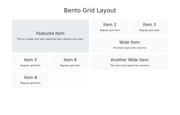 Responsive Bento Grid Layout
Bento grid layout using Bootstrap 5 and custom CSS
1 year ago2kv.5.3 -
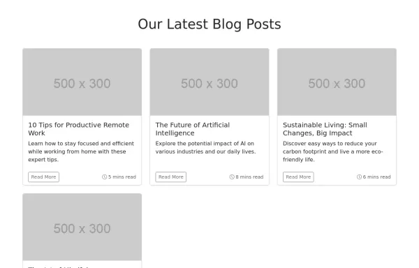 Blog Post Grid
Responsive blog post grid
1 year ago2.6kv.5.3 -
 1 year ago2.1kv.5.3
 -
 1 year ago1.6kv.5.3


Didn't find component you were looking for?
Search from 300+ componenent

