- → Prajwal Hallale
- → Card w/ gradient background
Card w/ gradient background
A modern and visually appealing card component with a gradient background and hover effect.
This bootstrap css example is contributed by Prajwal Hallale, on 20-Mar-2024. Component is made with bootstrap css v.5.3. It is responsive.

Author Prajwal Hallale
More Examples
-
 contact us page
do not copy
3 weeks ago51v.4.6 -
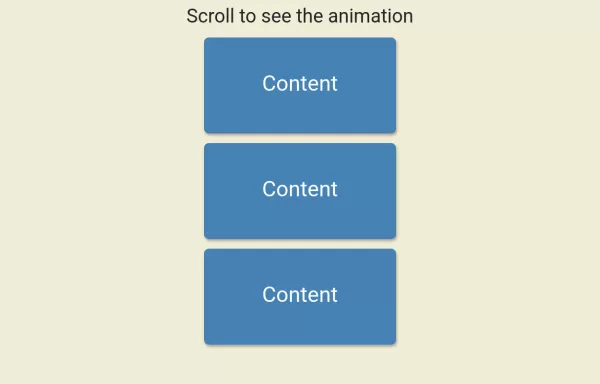 Scroll Animation
Scroll Animation
1 year ago3.5kv.4.6 -
1 month ago81v.5.3
-
3 weeks ago101v.4.6
-
3 weeks ago91v.4.6
-
 3 months ago272v.5.3
 -
main css
do not copy
3 weeks ago41v.4.6 -
3 weeks ago91v.4.6
-

-
 9 months ago1.3kv.5.3
 -
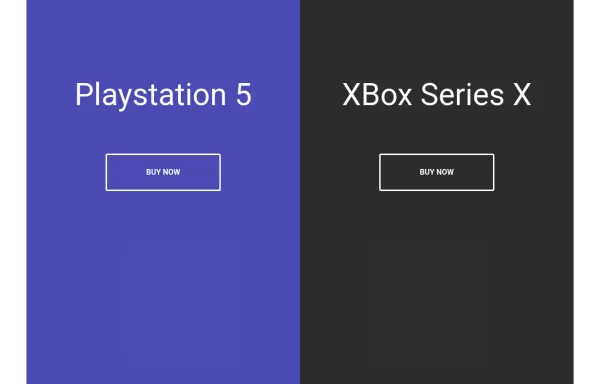 Split Landing Page
Split Landing Page
1 year ago1.7kv.4.6 -
 Carrousel banner product
It's a carousel; clicking on its categories opens a banner with the product.
2 months ago445v.5.3


Didn't find component you were looking for?
Search from 300+ componenent

