- → Anonymous
- → Bootstrap Product Card
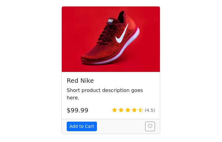
Bootstrap Product Card
This bootstrap css example is contributed by Anonymous, on 24-Jul-2024. Component is made with bootstrap css v.5.3. It is responsive. similar terms for this example is Product Showcase

Author Anonymous
More Examples
-
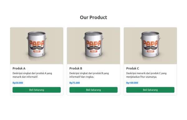
 Product Card
A product card layout for an e-commerce website with an image at the top
1 year ago18.2kv.5.3 -
 1 year ago2.8kv.5.3
 -
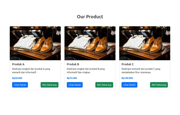
 Product Card
Card diseñada para mostrar productos de forma atractiva y ordenada, inspirada en Mercado Libre. Incluye imagen fija, título uniforme, precio anterior tachado, precio actual con descuento y etiquetas promocionales como "Envío gratis". Incorpora un efecto hover con sombra acentuada y usa clases CSS para fácil integración y mantenimiento.
1 year ago1.5kv.4.6 -
 3 months ago467v.4.6
 -
 9 months ago2.7kv.5.3
 -
 1 year ago2.1kv.5.3
 -
 8 months ago1.3kv.5.3
 -
 2 weeks ago38v.4.6
 -
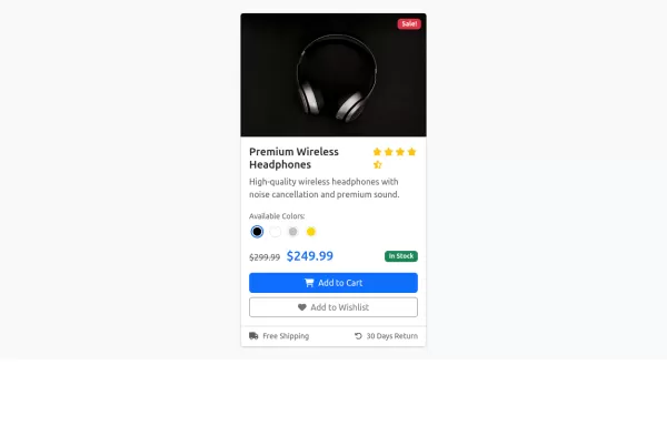
 for me
A modern and visually appealing card component with a gradient background and hover effect.
1 year ago1.8kv.5.3 -
 Contact Us Page with Google Maps and Form Validation
HTML: Form Fields: Includes fields for name, email, and message. Google Map: A div with an id of map where the Google Map will be displayed. Feedback Elements: <div> elements for displaying validation messages and success messages. CSS: Styling: Adds padding for the contact section, sets the map height, and styles feedback and success messages. JavaScript: Google Maps Initialization: Uses the Google Maps JavaScript API to create and display a map centered at specified coordinates. Replace YOUR_GOOGLE_MAPS_API_KEY with your actual API key. Form Validation: Validates the input fields and displays appropriate messages if the input is invalid or missing. How to Use: Replace API Key: Insert your Google Maps API key in the script tag for Google Maps. Customize Coordinates: Update the latitude and longitude in the initMap function to reflect your actual location. Validation Rules: Customize validation logic as needed for your form requirements.
1 year ago8.2kv.4.6 -
2 weeks ago36v.4.6
-
 2 months ago960v.5.3


Didn't find component you were looking for?
Search from 300+ componenent

