- → Rami AlAjo
- → Sound Board
Sound Board
Sound Board
This bootstrap css example is contributed by Rami AlAjo, on 25-Feb-2025. Component is made with bootstrap css v.4.6. It is responsive.

Author Rami AlAjo
More Examples
-
 3 weeks ago230v.4.6
 -
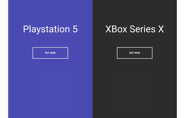 Split Landing Page
Split Landing Page
1 year ago1.9kv.4.6 -
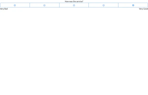 Likert Emoji Scale
A Likert scale using emoji (svgs of bootstrap emojis). Has a label, radio button group named btnradio, and text for either end of the scale
1 year ago1.4kv.5.3 -
1 week ago59v.5.3
-
2 years ago4.6kv.5.3
-
1 year ago3.1kv.5.3
-
1 week ago61v.5.3
-
1 month ago304v.4.6
-
 2 years ago2.7kv.5.3
 -
 4 months ago303v.5.3
 -
 Profile
PHW
5 months ago433v.5.3 -
 3 months ago625v.5.3


Didn't find component you were looking for?
Search from 300+ componenent

