- → zobaidul kaziex
- → Contact Us Page with Google Maps and For...
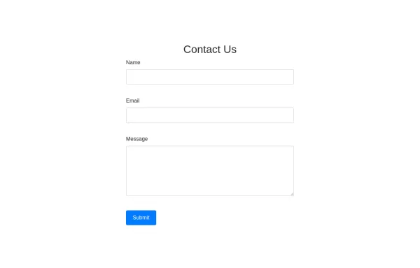
Contact Us Page with Google Maps and Form Validation
HTML:
Form Fields: Includes fields for name, email, and message.
Google Map: A div with an id of map where the Google Map will be displayed.
Feedback Elements: <div> elements for displaying validation messages and success messages.
CSS:
Styling: Adds padding for the contact section, sets the map height, and styles feedback and success messages.
JavaScript:
Google Maps Initialization: Uses the Google Maps JavaScript API to create and display a map centered at specified coordinates. Replace YOUR_GOOGLE_MAPS_API_KEY with your actual API key.
Form Validation: Validates the input fields and displays appropriate messages if the input is invalid or missing.
How to Use:
Replace API Key: Insert your Google Maps API key in the script tag for Google Maps.
Customize Coordinates: Update the latitude and longitude in the initMap function to reflect your actual location.
Validation Rules: Customize validation logic as needed for your form requirements.
This bootstrap css example is contributed by zobaidul kaziex, on 05-Sep-2024. Component is made with bootstrap css v.4.6. It is responsive. similar terms for this example are Get in touch, Contact form

Author zobaidul kaziex
More Examples
-
 2 years ago8.1kv.4.6
 -
 1 month ago301v.4.6
 -
3 weeks ago134v.5.3
-
3 weeks ago95v.5.3
-
3 weeks ago79v.5.3
-
3 weeks ago116v.5.3
-
2 weeks ago92v.5.3
-
Restrurant Website
Only for me
1 week ago79v.5.3 -
3 days ago26v.5.3
-
3 days ago59v.5.3
-
3 days ago13v.5.3
-
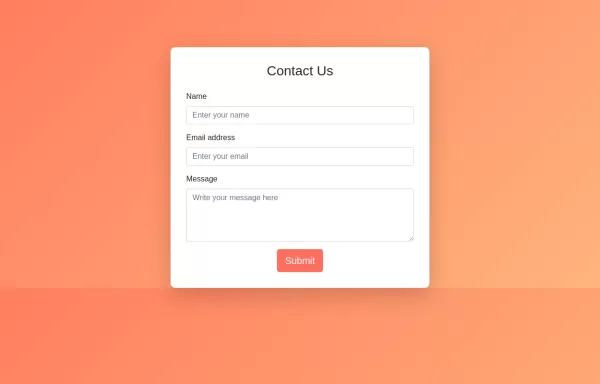 HTML, CSS, and Bootstrap. This approach will be purely HTML and CSS without any JavaScript.
HTML: Bootstrap Integration: Linked to Bootstrap CDN for styling. Form Structure: Contains input fields for name, email, and message, all within a card component. CSS: Background Gradient: Applied to the body for a visually appealing background. Card Styling: Rounded corners and padding for the card. Button Styling: Custom colors for the submit button, including hover effects. How to Use: Create an index.html file and copy the above code into it. Open the HTML file in your web browser to view the Contact Us form.
1 year ago3.2kv.4.6


Didn't find component you were looking for?
Search from 300+ componenent

