- → Nicholas
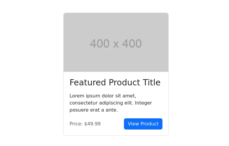
- → Card with background image
Card with background image
This bootstrap css example is contributed by Nicholas, on 05-Apr-2024. Component is made with bootstrap css v.4.6. It is responsive.
Author Nicholas
More Examples
-
2 months ago405v.4.6
-
2 years ago2.9kv.5.3
-
1 year ago7.7kv.5.3
-
1 month ago630v.5.3
-
Product Card
Card diseñada para mostrar productos de forma atractiva y ordenada, inspirada en Mercado Libre. Incluye imagen fija, título uniforme, precio anterior tachado, precio actual con descuento y etiquetas promocionales como "Envío gratis". Incorpora un efecto hover con sombra acentuada y usa clases CSS para fácil integración y mantenimiento.
1 year ago1.4kv.4.6 -
8 months ago2.1kv.5.3
-
Carrousel banner product
It's a carousel; clicking on its categories opens a banner with the product.
1 month ago292v.5.3 -
Card w/ gradient background
A modern and visually appealing card component with a gradient background and hover effect.
2 years ago4.7kv.5.3 -
1 year ago2.8kv.5.3
-
1 month ago236v.5.3
-
Pricing Page with Bootstrap and Icons
HTML: Navbar: Provides navigation links, including a link to the Pricing page. Pricing Section: Contains three columns, each representing a pricing plan with a card layout. Icons: Font Awesome icons are used for visual representation (e.g., stars and check circles). CSS: Card Styling: Adds border, shadow, and hover effects to the pricing cards. Plan-Specific Styles: Different border colors for each pricing plan (Free, Gold, Platinum). Button Styles: Different button colors to match the card styles. JavaScript: No custom JavaScript is required for this static pricing page, but you can add interactivity if needed. How to Use: Customize Content: Update the plan names, prices, features, and button actions as needed. Replace Icons: Choose different Font Awesome icons if desired by updating the <i> elements.
1 year ago1.7kv.4.6 -
2 months ago348v.4.6
Didn't find component you were looking for?
Search from 300+ componenent


