- → Anonymous
- → User Profile Card with Social Icons usin...
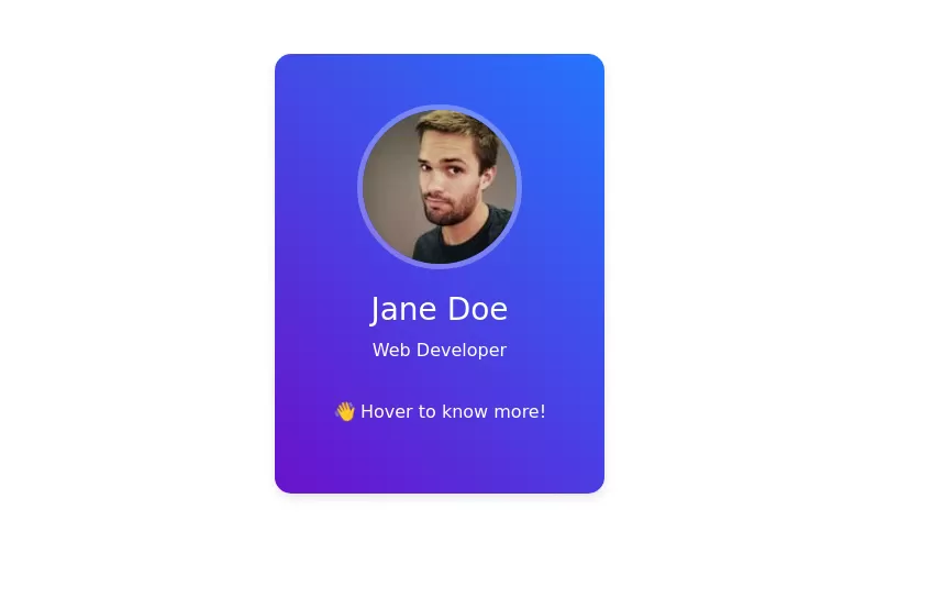
User Profile Card with Social Icons using Bootstrap 5
This bootstrap css example is contributed by Anonymous, on 01-Oct-2024. Component is made with bootstrap css v.5.3. It is responsive. similar terms for this example are Author box, User information

Author Anonymous
More Examples
-
 1 year ago4.7kv.5.3
 -

-
 Expanding Cards
Expanding Cards
1 year ago4.9kv.4.6 -
 About me section
je copy korbe she chor
1 month ago850v.4.6 -
1 week ago59v.5.3
-
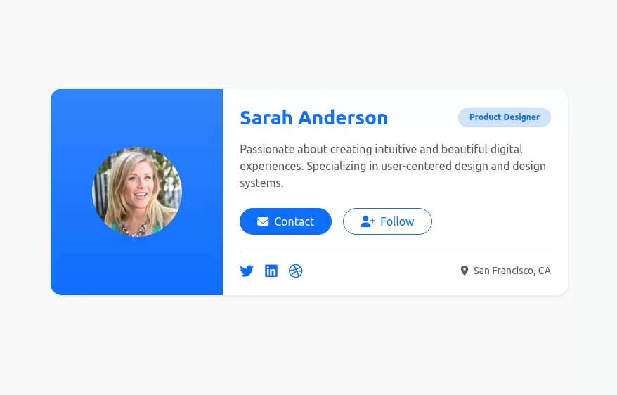 User profile card
Responsive author card
1 year ago8.3kv.5.3 -
 Profile
PHW
5 months ago436v.5.3 -
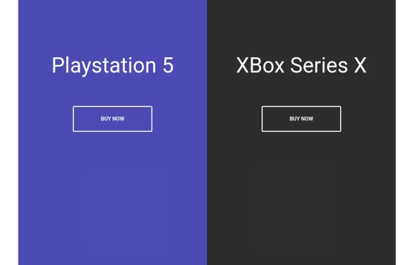 Split Landing Page
Split Landing Page
1 year ago1.9kv.4.6 -
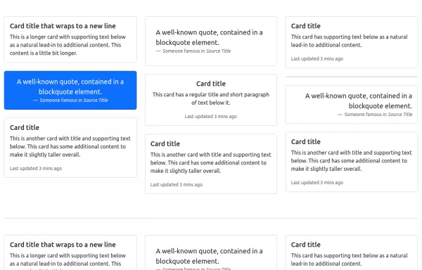 Card Layout
Using masonry in cards layout
1 year ago4.7kv.5.3 -
1 month ago313v.4.6
-
1 month ago486v.4.6
-
1 week ago58v.5.3


Didn't find component you were looking for?
Search from 300+ componenent

