- → Omar Khaled
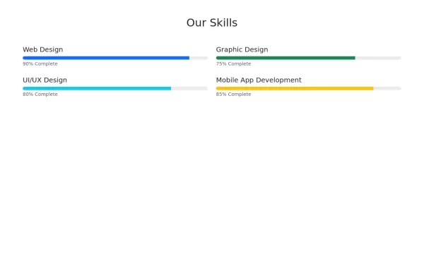
- → Default progress bar designs by boostrap...
Default progress bar designs by boostrap css
This bootstrap css example is contributed by Omar Khaled, on 29-Aug-2024. Component is made with bootstrap css v.5.3. It is responsive.

Author Omar Khaled
More Examples
-
 2 years ago2.6kv.5.3
 -
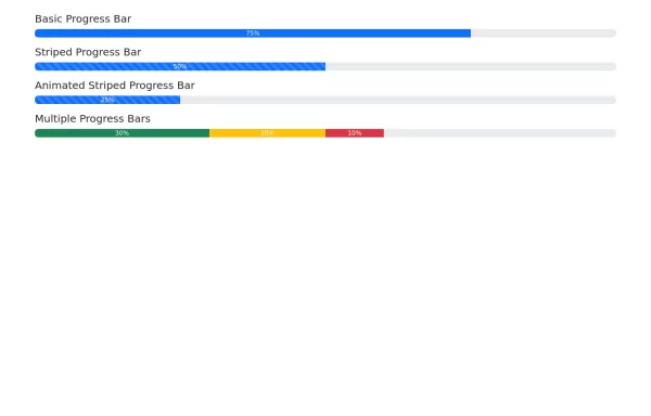 Progress bars
Progress bar variations
2 years ago1.6kv.5.3 -
 4 months ago253v.4.6
 -
 2 years ago5.8kv.5.3
 -
 1 year ago3.6kv.5.3
 -
 Gradient Footer Component
A modern, responsive footer component with a smooth gradient background, social icons, quick links, and newsletter subscription - perfect for contemporary web applications.
1 year ago4.6kv.5.3 -
 Clean Modern Footer Design with Social Media
Elegant light-themed footer with interactive elements, newsletter signup, and social media integration built with Bootstrap 5.3.
1 year ago6.9kv.5.3 -
Skill Section with Progress Bar
This is a responsive skill section built with Bootstrap and external CSS. It shows different skills with progress bars like HTML, CSS, Bootstrap and JavaScript.
5 months ago634v.4.6 -
 Image gallery in bootstrap
Responsive Image gallery
1 year ago6.2kv.5.3 -
 Rotating Navigation Animation
Rotating Navigation Animation
1 year ago2.7kv.4.6 -
5 months ago623v.4.6
-
 Call-to-Action Example
Call-to-Action section with bootstrap 5
2 years ago2kv.5.3


Didn't find component you were looking for?
Search from 300+ componenent

