- → StarCode Kh
- → Notification alert
Notification alert
notification alert bootstrapt 5.3
# alert-imessage
Alert message custom on bootstrap 5.3
# Example calls JS
// imessage.show("Default Success!", "success");
// imessage.show("Top Center Message!", "info", "top-center");
// imessage.show("Bottom Right Warning!", "warning", "bottom-right");
// imessage.show("Bottom Left Error!", "fail", "bottom-left");
// imessage.show("Centered Notification!", "info", "center");
This bootstrap css example is contributed by StarCode Kh, on 08-Mar-2025. Component is made with bootstrap css v.5.3. It is responsive. similar terms for this example is caution

Author StarCode Kh
More Examples
-
 1 month ago284v.4.6
 -
 8 months ago1.5kv.5.3
 -
 Premium Gradient Pricing Card
An eye-catching subscription component with interactive hover effects and clear feature presentation
1 year ago1.3kv.5.3 -
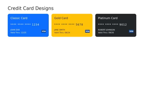 Credit cards bootstrap 5
credit cards design made with Bootstrap 5
1 year ago3.8kv.5.3 -
 1 year ago3.8kv.5.3
 -
 1 year ago4.2kv.5.3
 -
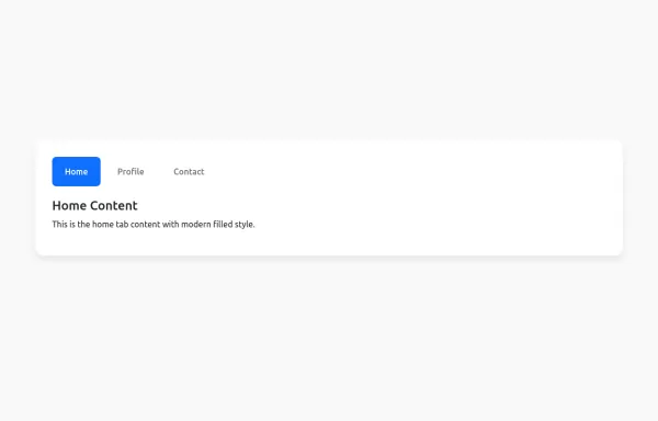 Bootstrap tabs filled
Clean, modern design with a filled background
1 year ago2.6kv.5.3 -
edu info
not copy
1 month ago703v.4.6 -
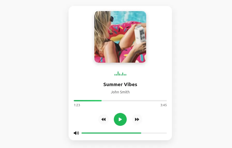 Music player with bootstrap 5
Animated music player design
1 year ago3.3kv.5.3 -
 Interactive left-Side Menu test
will need to be responsive
1 year ago6.7kv.5.3 -
 8 months ago1.1kv.5.3
 -
1 month ago565v.4.6


Didn't find component you were looking for?
Search from 300+ componenent

