- → Anonymous
- → Minimal breadcrumb
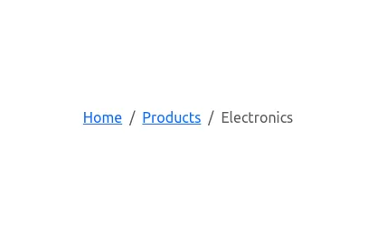
Minimal breadcrumb
This bootstrap css example is contributed by Anonymous, on 17-Jul-2024. Component is made with bootstrap css v.5.3. It is responsive.

Author Anonymous
More Examples
-
4 months ago333v.5.3
-
4 months ago468v.5.3
-
1 year ago4.9kv.4.6
-
Testimonials Carousel
showcase user testimonials
1 year ago1.1kv.5.3 -
Interactive Right-Side Menu
A sleek and responsive right sidebar featuring user profile, navigation, and activity feed with modern design elements
5 months ago3.8kv.5.3 -
4 weeks ago635v.5.3
-
4 months ago468v.5.3
-
Responsive footer using HTML and Bootstrap:
HTML: Error Title: A large, bold number (e.g., 404) to indicate the error type. Error Message: A brief message explaining the error. Button: A button to navigate back to the home page. Adjust the href attribute to point to your actual home page URL. CSS: Background Gradient: Applied to the body to give a stylish look. Error Container: Centered on the page with a semi-transparent background for contrast. Button Styling: Custom colors for the button, including hover effects. How to Use: Create an error.html file and paste the above code into it. Place the error.html file in your web server’s error pages directory or configure your server to serve this file on error.
8 months ago2.9kv.4.6 -
Footer example made with Bootstrap 5.3
Dark theme
4 months ago2.9kv.5.3 -
Button group
solid button group
1 year ago533v.5.3 -
HTML and JavaScript for Product Showcase Page
JavaScript: Pagination Handling: The script fetches images based on the current page and updates the pagination controls dynamically. Product Cards: Each product is displayed as a card with an image, title, description, and price
8 months ago734v.4.6 -
B- Bootstrap homepage with background color, hover effects, animations, and shadows added to enhance the design
B-Features Added: Background Gradient: A smooth gradient background using linear-gradient. Card Shadow and Hover Effect: The card now lifts up with a shadow (box-shadow) and smooth transition (transform) on hover. Button Customization: A custom round button with hover color change. Animation: The card content animates with a "fade-in-up" effect using keyframe animation.
1 month ago595v.4.6
Didn't find component you were looking for?
Search from 300+ componenent