- → Mason Ashford
- → Emoji Rating
Emoji Rating
An alternative, fun way for users to rate with emojis ranging from angry to love. Hovering over the emojis gives a playful animation effect, encouraging user interaction.
This bootstrap css example is contributed by Mason Ashford, on 23-Nov-2024. Component is made with bootstrap css v.5.3. It is responsive. similar terms for this example is Vote

Author Mason Ashford
More Examples
-
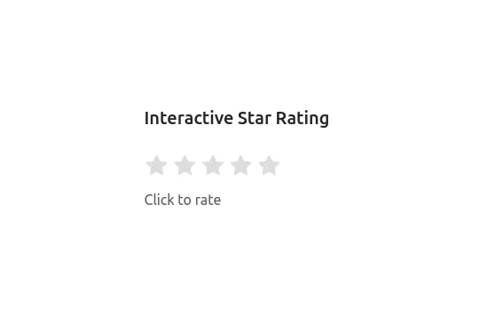 Interactive Star Rating
A dynamic star rating component where users can select their rating by clicking on stars. The rating can range from 1 to 5 stars, offering immediate visual feedback on hover and selection.
1 year ago16.6kv.5.3 -
 Rating section
Rating section fit form for taking user ratings and reviews
2 years ago4.6kv.5.3 -
 Beautiful Rating Component
Take user ratings with this form card
1 year ago2.6kv.5.3 -
 2 years ago6.7kv.5.3
 -
 Interactive Star Rating
A dynamic star rating component where users can select their rating by clicking on stars. The rating can range from 1 to 5 stars, offering immediate visual feedback on hover and selection.
1 year ago2.1kv.5.3 -
 4 months ago723v.4.6
 -
Navbar Specials
Navbar with special design
4 months ago400v.5.3 -
 Music Player
Working music player With start top buttons and progress bar
8 months ago759v.5.3 -
siam footer
footer
4 months ago377v.4.6 -
 Elegant Bootstrap Footer
with social media icons, newsletter forms, and other important links
1 year ago5.6kv.5.3 -
Rating section
Rating section fit form for taking user ratings and reviews
2 years ago4.6kv.5.3 -
 1 year ago2.4kv.5.3


Didn't find component you were looking for?
Search from 300+ componenent

