- → zobaidul kaziex
- → Bootstrap homepage with background color...
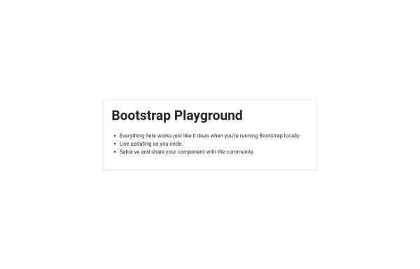
Bootstrap homepage with background color, hover effects, animations, and shadows added to enhance the design
Features Added:
Background Gradient: A smooth gradient background using linear-gradient.
Card Shadow and Hover Effect: The card now lifts up with a shadow (box-shadow) and smooth transition (transform) on hover.
Button Customization: A custom round button with hover color change.
Animation: The card content animates with a "fade-in-up" effect using keyframe animation.
This bootstrap css example is contributed by zobaidul kaziex, on 05-Sep-2024. Component is made with bootstrap css v.4.6. It is responsive.

Author zobaidul kaziex
More Examples
-
 2 months ago395v.4.6
 -
 Carrousel banner product
It's a carousel; clicking on its categories opens a banner with the product.
1 month ago290v.5.3 -
 Bootstrap 5 Example : Hero Section + 3 Columns
Bootstrap is the world's most famous free CSS framework.
1 day ago22v.4.6 -
B- Bootstrap homepage with background color, hover effects, animations, and shadows added to enhance the design
B-Features Added: Background Gradient: A smooth gradient background using linear-gradient. Card Shadow and Hover Effect: The card now lifts up with a shadow (box-shadow) and smooth transition (transform) on hover. Button Customization: A custom round button with hover color change. Animation: The card content animates with a "fade-in-up" effect using keyframe animation.
1 year ago2.7kv.4.6 -
 1 year ago1.2kv.5.3
 -
 Simple hero
Hero section with a linear gradient
1 year ago2.7kv.4.6 -
 10 months ago862v.4.6
 -
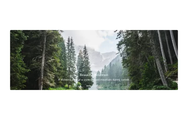 Image slider
Image slider with auto-scrolling and with title and description
1 year ago7kv.5.3 -
 1 year ago4.2kv.5.3
 -
 Collapsible Nested list
Tree structure design for nested list
1 year ago4.9kv.5.3 -
 1 year ago4.5kv.5.3
 -
 1 year ago4.5kv.5.3


Didn't find component you were looking for?
Search from 300+ componenent

