- → Ankit khedkar
- → Logo cloud
Logo cloud
Showcase your partners
This bootstrap css example is contributed by Ankit khedkar, on 17-Jul-2024. Component is made with bootstrap css v.5.3. It is responsive.

Author Ankit khedkar
More Examples
-
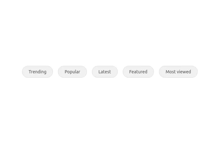 1 year ago2.6kv.5.3
 -
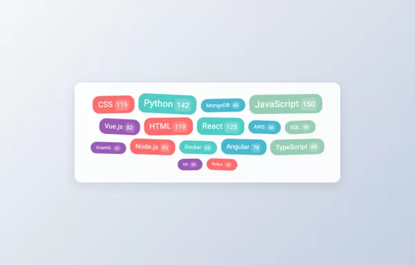 Interactive Tag Cloud
With: Hover animations Click Effects Random rotation Count badges Smooth transitions
1 year ago3.1kv.5.3 -
 4 months ago644v.4.6
 -
 Bootstrap 5 Section Dividers
8 divider examples
1 year ago3.9kv.5.3 -
 Call-to-Action Example
Call-to-Action section with bootstrap 5
1 year ago1.8kv.5.3 -
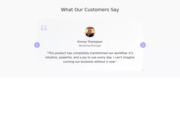 Elegant testimonial carousel
Interactive testimonial carousel with user avatars
1 year ago4.1kv.5.3 -
 11 months ago1.4kv.5.3
 -
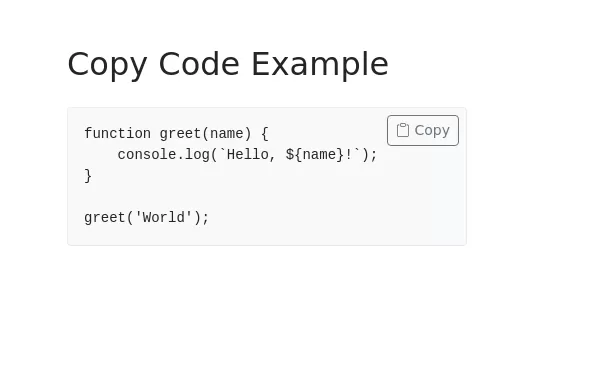 Copy Code Section
Code block with working copy option
1 year ago3.5kv.5.3 -
 Accordion FAQ section
Minimal and with beautiful animation
1 year ago10.5kv.5.3 -
 Underlined Tabs with bootstrap 5
Minimal design with underline indicator it has Smooth transitions
4 months ago522v.5.3 -
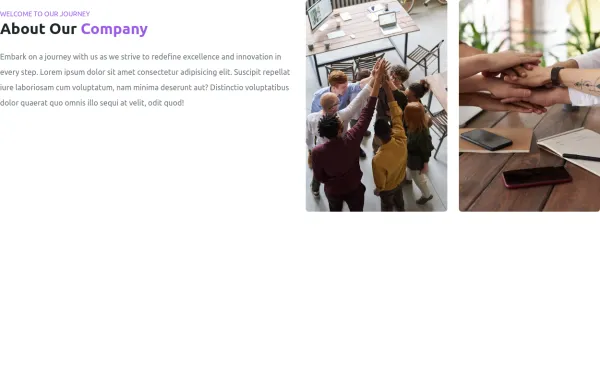
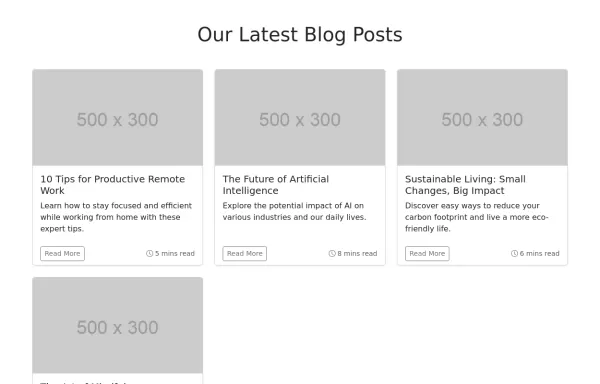 Blog Post Grid
Responsive blog post grid
1 year ago2.7kv.5.3 -
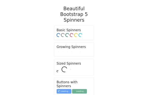 Beautiful Spinners made with Bootstrap 5
collection of loading spinners
1 year ago2.5kv.5.3


Didn't find component you were looking for?
Search from 300+ componenent

