- → Anonymous
- → Simple Pricing Card Component
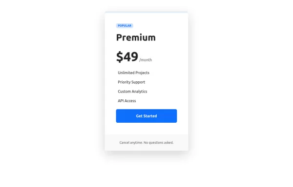
Simple Pricing Card Component
This bootstrap css example is contributed by Anonymous, on 21-Oct-2024. Component is made with bootstrap css v.5.3. It is responsive. similar terms for this example are Service rates, Subscription plans

Author Anonymous
More Examples
-
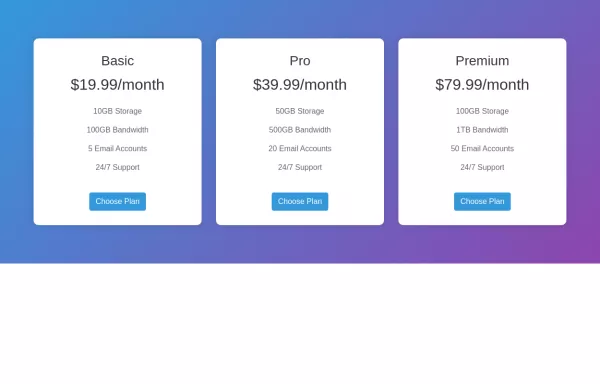
 1 year ago1.6kv.5.3
 -
 1 year ago2.3kv.5.3
 -
 1 year ago1.6kv.5.3
 -
 1 year ago6.9kv.5.3
 -
 Beautiful Pricing Cards
My project in class
1 year ago936v.4.6 -
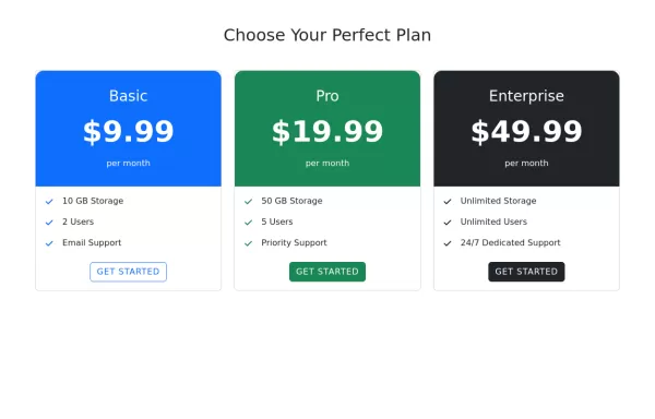
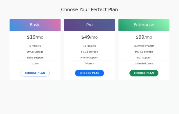 Pricing Cards
Three pricing tiers (Basic, Pro, and Enterprise) using Bootstrap's card component.
1 year ago3kv.5.3 -
 2 years ago2.7kv.4.6
 -
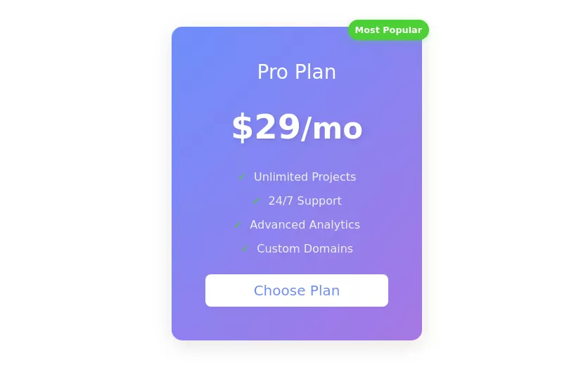 Pricing Card
with the most popular tag
1 year ago2.1kv.5.3 -
 2 years ago2kv.5.3
 -
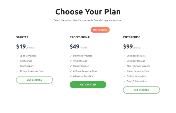
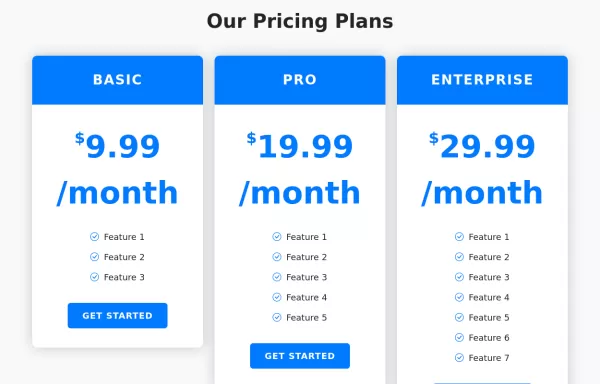
 Professional Bootstrap Pricing Table
Beautiful pricing component built with Bootstrap 5.3, featuring interactive hover effects, mobile-responsive layout, and professional design elements.
1 year ago5.5kv.5.3 -
 1 year ago1.1kv.5.3
 -
 Pricing Cards with Hover Effects
Clean and elegant pricing comparison component with Bootstrap 5.3
1 year ago1.8kv.5.3


Didn't find component you were looking for?
Search from 300+ componenent

