- → Ankit khedkar
- → Steps section
Steps section
This bootstrap css example is contributed by Ankit khedkar, on 30-Aug-2024. Component is made with bootstrap css v.5.3. It is responsive. similar terms for this example is stepper

Author Ankit khedkar
More Examples
-
 Horizontal Steps (Interactive)
Stepper component with Navigation buttons
1 year ago8.7kv.5.3 -
 Vertical Stepper (Interactive)
Stepper component with Navigation buttons
1 year ago8.8kv.5.3 -
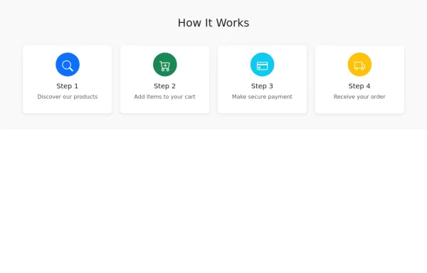 Steps Section
How it works section
1 year ago3.3kv.5.3 -
 1 year ago4.6kv.5.3
 -
 1 year ago5.9kv.5.3
 -
 1 week ago74v.5.3
 -
1 month ago381v.4.6
-
1 month ago328v.4.6
-
 1 year ago2.3kv.5.3
 -
 1 year ago4.1kv.5.3
 -
 Interactive Right-Side Menu
A sleek and responsive right sidebar featuring user profile, navigation, and activity feed with modern design elements
1 year ago11kv.5.3 -
 Cookie Consent Banner Made with bootstrap
Fade from the bottom with options and persistent storage
1 year ago4.5kv.5.3


Didn't find component you were looking for?
Search from 300+ componenent

