- → Kemaya m
- → Call to Action Block
Call to Action Block
This bootstrap css example is contributed by Kemaya m, on 28-Mar-2024. Component is made with bootstrap css v.4.6. It is responsive. similar terms for this example are CTA,banner

Author Kemaya m
More Examples
-
 CTA section
Simple CTA section
2 years ago2.3kv.4.6 -
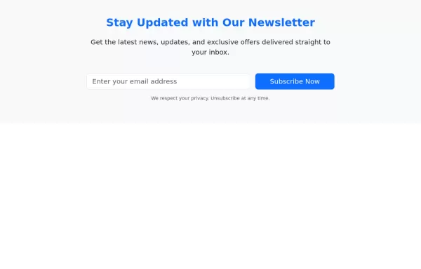 Newsletter CTA Section with Bootstrap 5
Clean and elegant Newsletter form
1 year ago2.3kv.5.3 -
 1 year ago1.5kv.5.3
 -
 Call-to-Action Example
Call-to-Action section with bootstrap 5
1 year ago1.8kv.5.3 -
 Call to action section
basic full-width CTA
2 years ago6.4kv.5.3 -
 CTA block
Beautiful CTA section with a form
1 year ago2.1kv.4.6 -
 Modern 404 Error Page with Lottie Animation and Bootstrap Layout
This elegant and responsive 404 error page is built with Bootstrap 5 and features a smooth, animated Lottie illustration to enhance user experience. The layout is fully responsive, with the animation and error message side-by-side on larger screens and stacked on smaller devices. It includes a clear "Back to homepage" button, making it user-friendly and ideal for maintaining engagement even when users encounter a broken link or missing page.
1 year ago5.8kv.5.3 -
 4 months ago285v.5.3
 -
 1 year ago7.8kv.5.3
 -
 Navbar
Basic Navbar with Dropdown
1 year ago2.5kv.4.6 -
 1 year ago2.4kv.5.3
 -
 1 month ago213v.4.6


Didn't find component you were looking for?
Search from 300+ componenent

