- → Ankit khedkar
- → Simple toast messages example
Simple toast messages example
Four different types of toasts:
Success (green)
Error (red)
Warning (yellow)
Info (blue)
Auto-dismisses after 3 seconds
This bootstrap css example is contributed by Ankit khedkar, on 20-Dec-2024. Component is made with bootstrap css v.5.3. It is responsive. similar terms for this example are Toast, Snackbar

Author Ankit khedkar
More Examples
-
 2 months ago598v.4.6
 -
5 days ago37v.4.6
-
2 months ago507v.4.6
-
 2 years ago8kv.5.3
 -
 2 years ago5.1kv.5.3
 -
 Music Player
Working music player With start top buttons and progress bar
6 months ago622v.5.3 -
 Modern 404 Error Page with Lottie Animation and Bootstrap Layout
This elegant and responsive 404 error page is built with Bootstrap 5 and features a smooth, animated Lottie illustration to enhance user experience. The layout is fully responsive, with the animation and error message side-by-side on larger screens and stacked on smaller devices. It includes a clear "Back to homepage" button, making it user-friendly and ideal for maintaining engagement even when users encounter a broken link or missing page.
1 year ago6.4kv.5.3 -
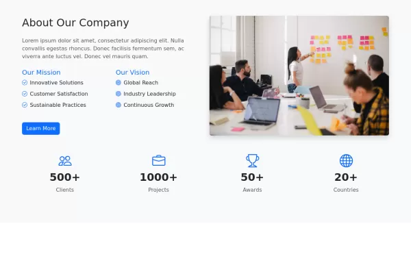 About Our Company
Display your company data
2 years ago3.4kv.5.3 -
 Card Layout
Using masonry in cards layout
1 year ago4.7kv.5.3 -
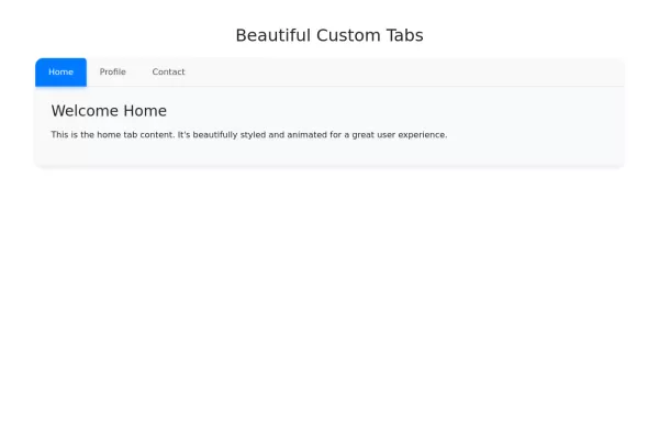 Tabs example
Beautiful custom tabs example with Bootstrap 5
1 year ago4.5kv.5.3 -
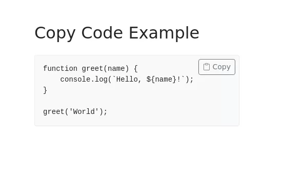 Copy Code Section
Code block with working copy option
1 year ago3.6kv.5.3 -
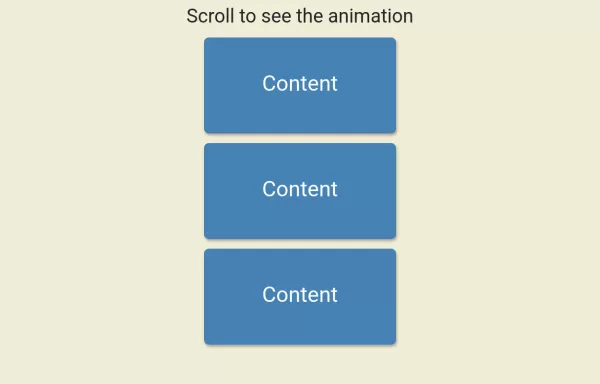 Scroll Animation
Scroll Animation
1 year ago3.8kv.4.6


Didn't find component you were looking for?
Search from 300+ componenent

