- → Anonymous
- → Sticky Table Headings Example
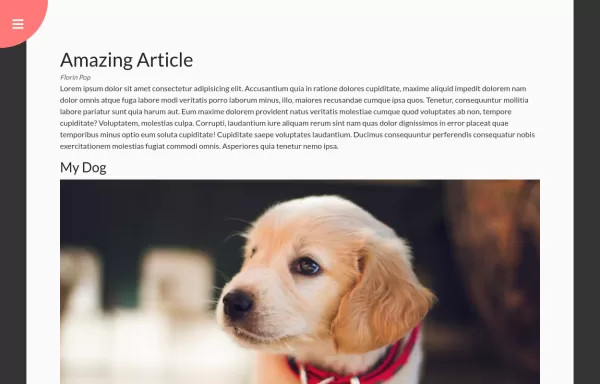
Sticky Table Headings Example
This bootstrap css example is contributed by Anonymous, on 13-May-2025. Component is made with bootstrap css v.5.3. It is responsive.

Author Anonymous
More Examples
-
 Hidden Search Widget
Hidden Search Widget
1 year ago1.6kv.4.6 -
 Fitar's navbar
do not copy
1 month ago730v.4.6 -
 Rotating Navigation Animation
Rotating Navigation Animation
1 year ago2.4kv.4.6 -
e mask 3
portfolio
1 month ago224v.4.6 -
 10 months ago2.4kv.5.3
 -
 asdad
asdadasdad
2 months ago689v.5.3 -
2 weeks ago94v.4.6
-
2 weeks ago176v.4.6
-
Bootstrap 5 Example : Hero Section + 3 Columns
Bootstrap is the world's most famous free CSS framework.
1 month ago319v.4.6 -
 10 months ago3.5kv.5.3
 -
2 weeks ago317v.4.6
-
1 month ago174v.4.6


Didn't find component you were looking for?
Search from 300+ componenent

