- → java stories story
- → navbar white simple #1
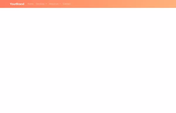
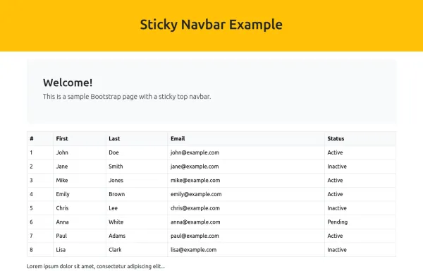
navbar white simple #1
This bootstrap css example is contributed by java stories story, on 30-Jul-2025. Component is made with bootstrap css v.5.3. It is responsive.

Author java stories story
More Examples
-
 HTML, CSS, and JavaScript for Multi-layer Dropdown Header
HTML: Added dropdown-submenu class to handle nested dropdowns. CSS: Dropdown Submenu: Positioned to the right of the parent dropdown. JavaScript: Event Listeners: Added to show and hide nested dropdowns on mouse enter and leave. How to Use: Create an header.html file and paste the updated code into it. Include Bootstrap and Font Awesome if needed for styling and icons.
1 year ago2.9kv.4.6 -
 8 months ago2.6kv.5.3
 -
 8 months ago4kv.5.3
 -
 Hidden Search Widget
Hidden Search Widget
1 year ago1.4kv.4.6 -
 asdad
asdadasdad
1 week ago60v.5.3 -
 8 months ago3.1kv.5.3
 -
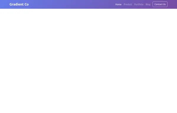
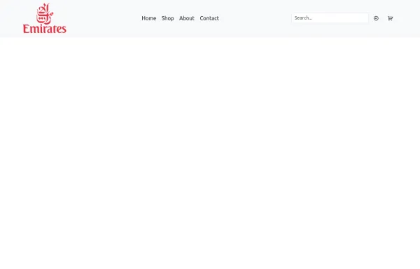
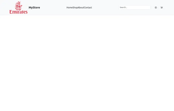 Responsive Bootstrap Navbar with Mobile Toggle and Remix Icons
This responsive Bootstrap 5 navbar features a clean and modern design, enhanced with Remix Icons for login and cart functionality. It includes a desktop navigation layout with a logo, links, search bar, and action buttons, while the mobile version adapts seamlessly with a toggle menu. Ideal for e-commerce or multipage websites seeking a sleek and user-friendly header layout.
11 months ago2.9kv.5.3 -
 8 months ago2.1kv.5.3
 -
 Rotating Navigation Animation
Rotating Navigation Animation
1 year ago2.1kv.4.6 -
 7 months ago1.9kv.5.3
 -
 11 months ago3.1kv.5.3
 -
 Responsive Bootstrap Navbar with Mobile Toggle and Remix Icons
This responsive Bootstrap 5 navbar features a clean and modern design, enhanced with Remix Icons for login and cart functionality. It includes a desktop navigation layout with a logo, links, search bar, and action buttons, while the mobile version adapts seamlessly with a toggle menu. Ideal for e-commerce or multipage websites seeking a sleek and user-friendly header layout.
11 months ago3.3kv.5.3


Didn't find component you were looking for?
Search from 300+ componenent

