- → Juniper
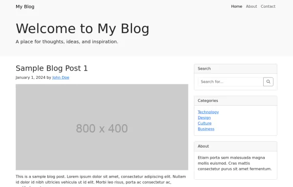
- → Responsive blog home layout
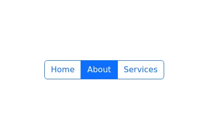
Responsive blog home layout
This bootstrap css example is contributed by Juniper, on 21-Oct-2024. Component is made with bootstrap css v.5.3. It is responsive. similar terms for this example is blog template

Author Juniper
More Examples
-
 1 year ago2.9kv.5.3
 -
 8 months ago791v.4.6
 -
 Blog post layout
Minimal and clean blog post layout
1 year ago3.8kv.5.3 -
 1 year ago7.2kv.5.3
 -
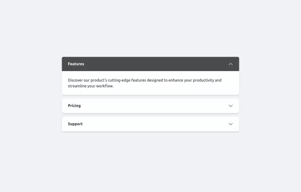 Accordion example with Bootstrap 5.3
accordion with animation
1 year ago3kv.5.3 -
-
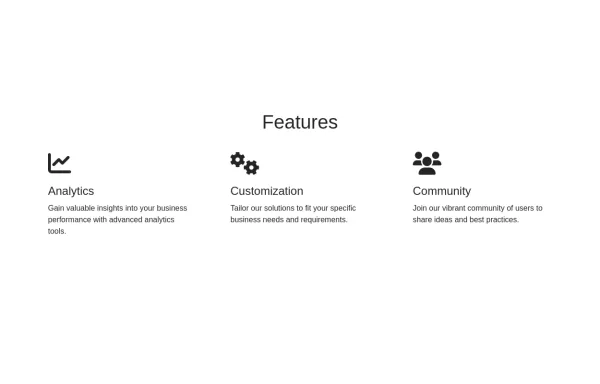 Features section
Showcase features with icons
1 year ago1.4kv.4.6 -
 1 year ago6.1kv.5.3
 -
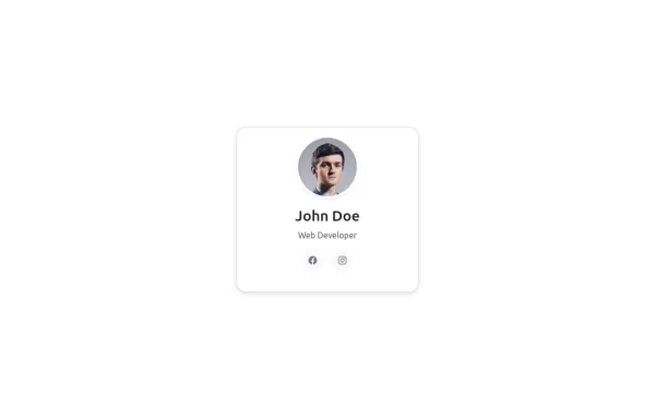
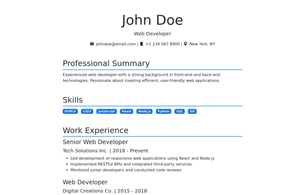 Resume template
Simple and elegant resume template
1 year ago1kv.5.3 -
 Features Section
with icons
1 year ago2.6kv.5.3 -
 1 year ago885v.5.3
 -
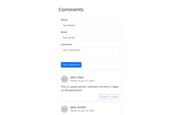 Bootstrap comment box with reply
Comment form design
1 year ago8.4kv.5.3


Didn't find component you were looking for?
Search from 300+ componenent

