- → All Components
- → Page 12
All components
-
 1 year ago1.4kv.5.3
 -
-
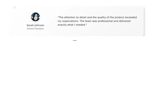
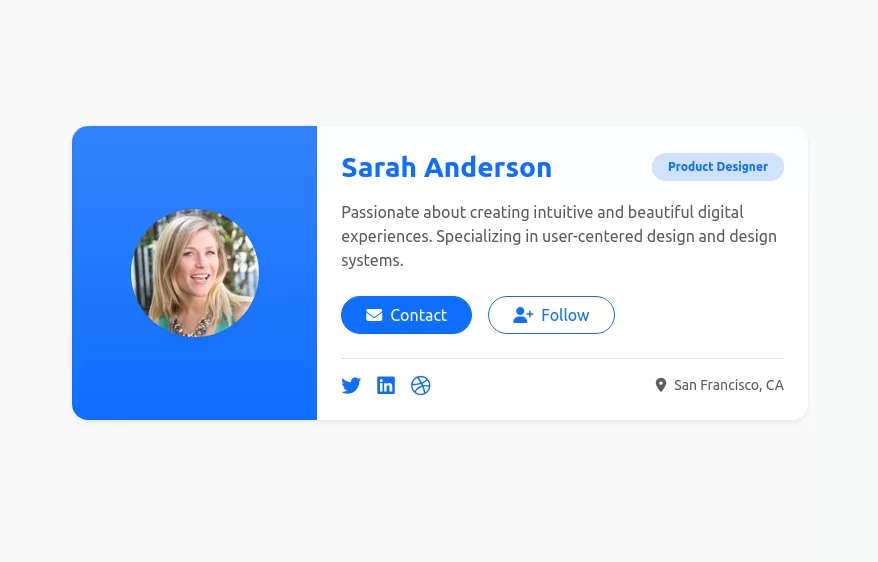 User profile card
Responsive author card
1 year ago7.2kv.5.3 -
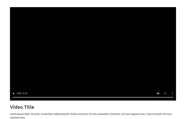
 Bootstrap with VideoJS player
Video player with buttons
1 year ago1.7kv.5.3 -
 Bootstrap with VideoJS player
Video player with buttons
1 year ago2.1kv.5.3 -
 1 year ago1.9kv.5.3
 -
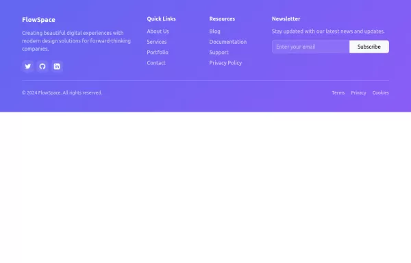 Gradient Footer Component
A modern, responsive footer component with a smooth gradient background, social icons, quick links, and newsletter subscription - perfect for contemporary web applications.
1 year ago3.3kv.5.3 -
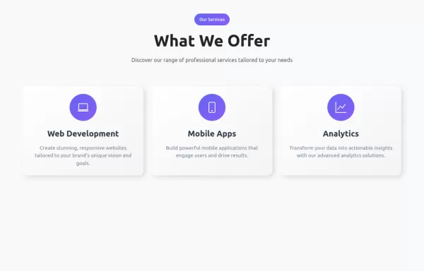
 Feature Cards
showcases three key features with a clean, minimal design.
1 year ago2.9kv.5.3 -
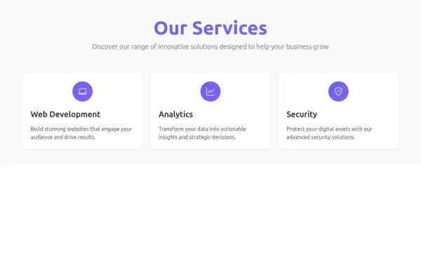
 Service Cards with Hover Effects
service showcase component featuring neuromorphic design cards with smooth hover effects, gradient accents, and responsive layout.
1 year ago3.7kv.5.3 -
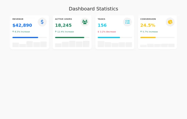
 Modern Dashboard Analytics Card
A sleek, modern dashboard component featuring animated metric cards with progress indicators and trend badges. Perfect for displaying key business metrics like revenue, users, and orders with visual progress tracking.
1 year ago4.4kv.5.3 -
 1 year ago6.1kv.5.3
 -
 1 year ago2.8kv.5.3
 -
 1 year ago7.2kv.5.3
 -
 1 year ago4.3kv.5.3
 -
 1 year ago2.5kv.5.3
 -
 1 year ago2.8kv.5.3


